The story icons have been bugging me. When I first designed them they looked like books, like this:

I didn’t like the books. They felt too old and dusty. Felt too confined. I worried if people saw a screen shot of the app they’d think it was an app for reading books.
So I designed something more abstract. Something that looked like a book but also more than a book. I did this:

But these haven’t been sitting well with me either. The sharp angles contradict the softness of the rest of the app.
Here’s the new design I’ve been working on for the story icons:
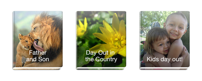
Still abstract in nature, still have the ‘light’ shining from inside but I’ve given them the roundness of the original books. I love these.