Take a look at this:
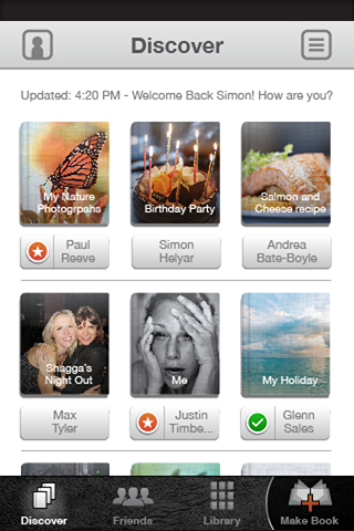
White screen with some booky looking icons on it. Real simple. Barely even designed. Like a Mondrian. Like the original iPod. Like some Deiter Rams thing.
It started like this, this is the first rough:
Paul was like “Looks like shit mate.” It really does. Whatever, it was the rough. The next major design stage was this:
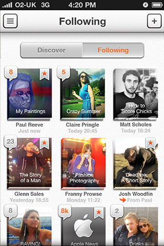
Then this, it was this for weeks. Note the nav bar at the top and bottom:
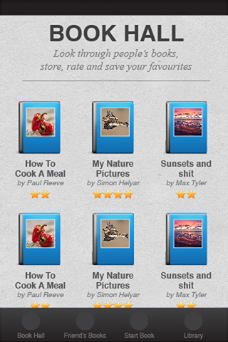
Before finally looking like this (lost the bottom nav but none of the function – total simplicity):
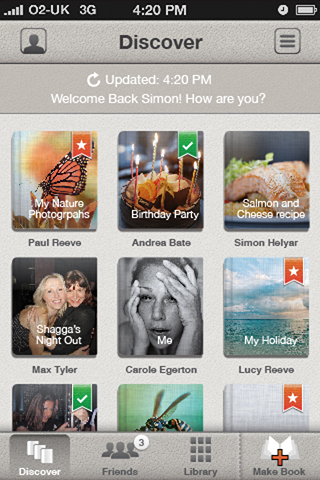
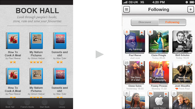
So yeah, this to this… :
… took three months and this much work: